
How to Add a Property to a Component
- 1. Adding a Property to the Properties Panel
- 2. Changing the Designer View When a Property Changes
- 3. Changing the Android Representation of the Component
- 4. Update Version Numbers
- 5. Deprecating Methods, Events and Properties
- 6. Internationalization
- 7. Adding the Property on iOS
- 8. Testing and Checklist
This document describes how to add a new property to an existing App Inventor component, on both Android and iOS. If you are creating a whole new component, read How to Add a Component first. That document explains the annotations, the class hierarchy and the build, and this one goes deeper into the steps that are specific to properties.
Paths are relative to the appinventor/ directory of the repository. We abbreviate three common prefixes:
RTiscomponents/src/com/google/appinventor/components/runtime, the Android runtime classes.Ciscomponents/src/com/google/appinventor/components, which also holds the annotations.AEisappengine/src/com/google/appinventor/client, the Designer (the browser client).
As an example, we walk through the Shape property of the ButtonBase component, from the property editor to the version numbers. ButtonBase is an abstract superclass of the Button and Picker components (ContactPicker, ImagePicker, ListPicker and so on), so all properties defined for ButtonBase are also defined for Button and the pickers. Without a shape property a button uses the system’s default shape, which varies from device to device. The Shape property offers four choices: default, rounded, rectangular and oval. All examples in this document show the Button component but would be the same for any of the Picker components.
The code in this document is taken from the current source and is shortened to show the parts that matter when you add a property.
The user will first see the new property in the Button component’s Properties panel in the Designer. Because the choices should be restricted to the four legal values, we will create a property editor that limits the choices to these values and maps them to integers for the internal representation of the property. When the user changes the value of the Shape property, the visual representation of the Button component in the Designer must change so that the user can preview the interface. To do this we will create a method that changes the attributes of the GWT widget that represents the Button component in the Designer. Finally, since the user ultimately wants the property changed on their device, we will add code that changes the button’s background drawable (Android) or layer (iOS) depending on which Shape value is selected.
The steps, and when they are needed, are:
| Step | Where | When |
|---|---|---|
| 1. A property editor | AE, PropertyTypeConstants, PropertiesUtil |
only if no existing editor fits |
| 2. The getter and the setter with their annotations | the Java component in RT |
always |
| 3. The Designer view | the mock component in AE/editor/simple/components/ |
only if the property changes how the component looks in the Designer |
| 4. The Android behavior | the Java component in RT |
always |
| 5. The version numbers and the upgraders | YaVersion.java, YoungAndroidFormUpgrader.java, versioning.js |
always, for an existing component |
| 6. The iOS behavior | the Swift class in components-ios/src |
if the component exists on iOS |
1. Adding a Property to the Properties Panel
The first step is to add the property so that it appears in the Properties panel when a Button is selected. This change is shown in Figure 1. Every property is associated with a property editor, to allow the user to choose among legal values. Often, an existing property editor can be used, but in some cases, such as the Shape property, it will be necessary to create a new one. Finally, we associate the property with the component so that the property appears in the Properties panel when the component is selected.
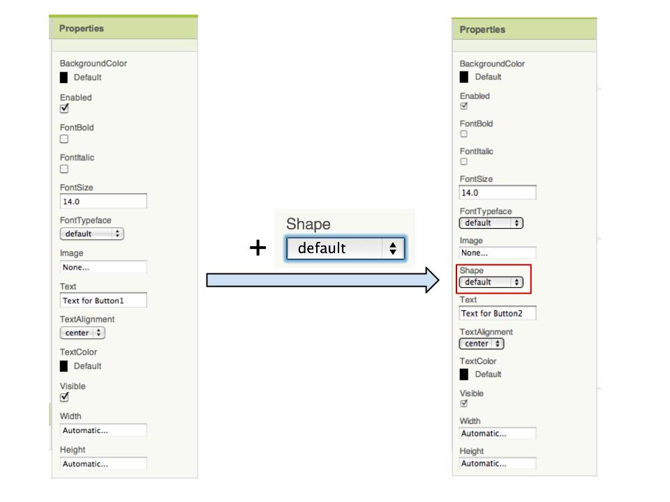
Figure 1: The Button Properties panel before and after the Shape property is added.
1.1 Property editors
Each property has a PropertyEditor (AE/widgets/properties/PropertyEditor.java) that controls what values can be specified in the Designer. Some existing property editors are the YoungAndroidBooleanPropertyEditor (used by ButtonBase.Enabled) and the NonNegativeFloatPropertyEditor (used by ButtonBase.FontSize). The generic editors are in AE/widgets/properties/ and the ones that are specific to App Inventor are in AE/editor/youngandroid/properties/. The editor types that a component can choose from are the constants of PropertyTypeConstants (C/common/PropertyTypeConstants.java), and Table 2 of How to Add a Component lists the most common ones. If a suitable editor already exists, simply note its editor type and skip to Section 1.3. Otherwise a new property editor needs to be created as described in Section 1.2.
For a short, fixed list of choices you may not need a new class at all: the editor type PROPERTY_TYPE_CHOICES shows a drop-down with the choices that you list in the editorArgs element of @DesignerProperty (for example FilePicker.Action).
The editor associated with the Shape property must offer a drop-down menu with the four legal shape values: default, rounded, rectangular and oval (as shown in Figure 2). Since this does not already exist, a new property editor must be created.
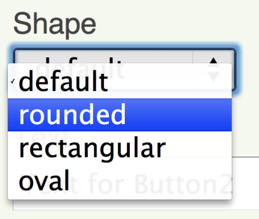
Figure 2: The Shape property editor in the Designer.
1.2 Creating a new property editor
1.2.1 Creating the new property editor class
The new property editor class must extend the PropertyEditor class and restrict the user inputs to only legal values. This class also defines how the editor is displayed to the user (a drop-down menu, a text box, and so on).
For our example the new class is called YoungAndroidButtonShapeChoicePropertyEditor (AE/editor/youngandroid/properties/), and it extends the ChoicePropertyEditor class (AE/widgets/properties/ChoicePropertyEditor.java), which itself extends PropertyEditor. This new class must define an array of Choice objects and pass the array to the ChoicePropertyEditor constructor, which creates the drop-down choice widget. A Choice is a static class defined in ChoicePropertyEditor and its constructor takes two strings: the caption and the value. The caption string is the text to be shown in the drop-down choice widget. The value string is the value assigned to the property if the choice is selected. The new class is defined in Figure 4.
The first step is to define the four descriptive strings (the caption strings), which are displayed to the user and placed in the array passed to the ChoicePropertyEditor. This is done by adding the following code to the OdeMessages interface (AE/OdeMessages.java). The reason the strings are defined in a separate file rather than hard-coded is to support abstraction and internationalization: the translations of these strings go into the OdeMessages_<language>.properties files.
// Used in editor/youngandroid/properties/YoungAndroidButtonShapeChoicePropertyEditor.java

@DefaultMessage("default")                              // this is what will be displayed to the user
@Description("Text for button shape choice 'default'")  // this string is information for a translator
String defaultButtonShape();                            // the name of the descriptive string is made up at this point

@DefaultMessage("rounded")
@Description("Text for button shape choice 'rounded'")
String roundedButtonShape();

@DefaultMessage("rectangular")
@Description("Text for button shape choice 'rectangular'")
String rectButtonShape();

@DefaultMessage("oval")
@Description("Text for button shape choice 'oval'")
String ovalButtonShape();
Figure 3: Defining the strings in the OdeMessages interface.
Now that the strings are defined, the YoungAndroidButtonShapeChoicePropertyEditor class can be created as shown in Figure 4.
package com.google.appinventor.client.editor.youngandroid.properties;

import static com.google.appinventor.client.Ode.MESSAGES;
import com.google.appinventor.client.widgets.properties.ChoicePropertyEditor;

/**
 * Property editor for button shape.
 */
public class YoungAndroidButtonShapeChoicePropertyEditor    // extend ChoicePropertyEditor
    extends ChoicePropertyEditor {
  // Button shape choices
  private static final Choice[] shapes = new Choice[] {     // define an array of the choices
    new Choice(MESSAGES.defaultButtonShape() + " : " + "0", "0"),
    new Choice(MESSAGES.roundedButtonShape() + " : " + "1", "1"),
    new Choice(MESSAGES.rectButtonShape() + " : " + "2", "2"),
    new Choice(MESSAGES.ovalButtonShape() + " : " + "3", "3")
  };

  public YoungAndroidButtonShapeChoicePropertyEditor() {
    super(shapes);                                          // pass the array to the ChoicePropertyEditor constructor
  }
}
Figure 4: The YoungAndroidButtonShapeChoicePropertyEditor class. The caption of each choice also shows its value, as in “default : 0”.
The value strings (“0”, “1”, “2” and “3” in Figure 4) are assigned to the property and can be accessed via the component’s getters and setters. When the string is retrieved by the component’s getter it is retrieved as an int, for which constants should be defined in the Component class. We define the constants in the Component interface since all components inherit from it, so the code in Figure 5 is added.
/*
 * Button Styles.
 */
static final int BUTTON_SHAPE_DEFAULT = 0;
static final int BUTTON_SHAPE_ROUNDED = 1;
static final int BUTTON_SHAPE_RECT = 2;
static final int BUTTON_SHAPE_OVAL = 3;
Figure 5: Defining the values in the Component class.
The choices are also described by a Java enumeration, ButtonShape (C/common/ButtonShape.java), which implements OptionList. It is what the getter and the setter refer to with @Options(ButtonShape.class), and it gives the Blocks Editor a drop-down of named choices (Default, Rounded, Rectangular and Oval) in place of bare numbers. For a new property with a fixed set of choices, define such an enumeration. Its values must be the same numbers as the values of the editor.
public enum ButtonShape implements OptionList<Integer> {
  @Default
  Default(0),
  Rounded(1),
  Rectangular(2),
  Oval(3);
  ...
}
1.2.2 Adding the new property editor to the Properties panel
The editors are created in the method createPropertyEditor() of the class PropertiesUtil (AE/editor/simple/components/utils/PropertiesUtil.java). First, we need to define a constant for the editor type in the PropertyTypeConstants class (C/common/PropertyTypeConstants.java). Add the following code:
/**
 * Button shapes.
 * @see com.google.appinventor.client.editor.youngandroid.properties.YoungAndroidButtonShapeChoicePropertyEditor
 */
public static final String PROPERTY_TYPE_BUTTON_SHAPE = "button_shape";
Then add the following case to the createPropertyEditor() method inside PropertiesUtil. An editor type that is not handled there falls back to a plain text box:
} else if (editorType.equals(PropertyTypeConstants.PROPERTY_TYPE_BUTTON_SHAPE)) {
  return new YoungAndroidButtonShapeChoicePropertyEditor();
Figure 6: Addition to PropertiesUtil.createPropertyEditor().
1.3 Associate the property with the component
Create a getter and a setter method for the new property in the component’s class. Both the getter and the setter must be marked with the SimpleProperty annotation. The SimpleProperty annotation consists of a description, the property’s category and whether or not the property is visible in the Blocks Editor (userVisible). The setter must also be marked with the DesignerProperty annotation. This annotation consists of the property’s editor type, which is one of the constants of PropertyTypeConstants, and the default value of the property. Section 5.3 of How to Add a Component describes each element in detail.
For this example, the following code needs to be added to the ButtonBase class.
This is the getter:
/**
 * Returns the style of the `%type%`.
 *
 * @return  one of {@link Component#BUTTON_SHAPE_DEFAULT},
 *          {@link Component#BUTTON_SHAPE_ROUNDED},
 *          {@link Component#BUTTON_SHAPE_RECT} or
 *          {@link Component#BUTTON_SHAPE_OVAL}
 */
@SimpleProperty(                       // the description can be left blank: the default is ""
    category = PropertyCategory.APPEARANCE)   // the category only needs to be specified in either the setter or the getter
public @Options(ButtonShape.class) int Shape() {    // the name of the method is displayed in the Properties panel
  return shape;
}
Figure 7: The Shape getter.
Use userVisible = false only for a property that should be set in the Designer but not in the Blocks Editor.
This is the setter:
/**
 * Specifies the shape of the `%type%`. The valid values for this property are `0` (default),
 * `1` (rounded), `2` (rectangle), and `3` (oval). The `Shape` will not be visible if an
 * {@link #Image()} is used.
 *
 * @param shape one of {@link Component#BUTTON_SHAPE_DEFAULT},
 *          {@link Component#BUTTON_SHAPE_ROUNDED},
 *          {@link Component#BUTTON_SHAPE_RECT} or
 *          {@link Component#BUTTON_SHAPE_OVAL}
 *
 * @throws IllegalArgumentException if shape is not a legal value.
 */
@DesignerProperty(editorType = PropertyTypeConstants.PROPERTY_TYPE_BUTTON_SHAPE,   // the editor type from Section 1.2.2
    defaultValue = Component.BUTTON_SHAPE_DEFAULT + "")                             // the default value, as a String
@SimpleProperty(description = "Specifies the shape of the %type% (default, rounded," +
    " rectangular, oval). The shape will not be visible if an Image is being displayed.")
public void Shape(@Options(ButtonShape.class) int shape) {
  this.shape = shape;
  updateAppearance();
}
Figure 8: The Shape setter.
Because ButtonBase is shared by several components, its descriptions use the placeholder %type%, which the build replaces with the name of the component that shows the description.
Then define the variable shape inside the same file with the following code.
// Backing for button shape
private int shape;
And add the following line to the ButtonBase constructor, so that the component starts with the default that the annotation declares.
Shape(Component.BUTTON_SHAPE_DEFAULT);
After implementing the code in this section, the Shape property appears in the Properties panel when a Button is selected in the Designer. However, changing the property does not yet affect the appearance of the Button.
You do not need to write the name or the description of the property anywhere else. The name and the description of a property, method or event are generated from the annotations and the Javadoc, and the reference documentation is generated too (Section 6). The only strings you add to OdeMessages.java are the ones used by the code of a new editor, such as the captions in Figure 3.
2. Changing the Designer View When a Property Changes
The app’s user interface can be viewed in two locations. The first is the Designer and the second is the device (a phone, a tablet or an emulator). The Designer is the view shown in the browser window and is what is changed in this section.
Every visible component has a corresponding mock class in the appengine client. The mock class is the visual representation of the component in the Designer, and the mock classes generally follow the same hierarchy as the component classes. If your property changes visual aspects of the component (such as its color), then the mock class of that component must adjust the Designer to show these visual changes. If it does not, skip to Section 3. (Non-visible components are all shown by the same generic mock, so there is nothing to do for them.)
The definition of the property is not written in the mock: the property (its name, editor, default and category) is created automatically from the annotations. The mock only reacts to the value changing.
2.1 Change the component’s attributes
There are already a number of methods written to change a component’s attributes in MockComponent, MockComponentsUtil and MockVisibleComponent (AE/editor/simple/components/), and most component mock classes inherit from at least one of these classes.
To change the appearance in the Designer, find the mock class that corresponds to the component to which the property was added. Determine whether the class inherits a method that changes the appropriate attribute. If such a method exists, simply write a method that calls it with the appropriate arguments, as done in the setEnabledProperty() method of the MockButtonBase class. If a method doesn’t exist, then follow this Shape property example.
For this example the mock class associated with the ButtonBase component is MockButtonBase. Figure 9 shows the appearance in the Designer for each value of the Shape property.
| Shape | Image |
|---|---|
| default | 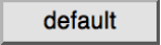 |
| rounded | 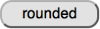 |
| rectangular | 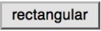 |
| oval | 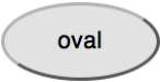 |
Figure 9: The mock buttons in the Designer.
Mock components are built on top of GWT widgets. MockButtonBase creates a button widget that uses the browser’s defaults, and to make the shapes above the button’s corner radii need to be changed. There does not already exist a method in MockButtonBase or any of its superclasses that could change a button’s corner radii, so the following method (Figure 10) is added to MockButtonBase (AE/editor/simple/components/MockButtonBase.java).
// Legal values for shape are defined in
// com.google.appinventor.components.runtime.Component.java.
private int shape;

/*
 * Sets the button's Shape property to a new value.
 */
private void setShapeProperty(String text) {
  shape = Integer.parseInt(text);
  switch(shape) {
    case 0:
      // Default Button
      buttonWidget.getElement().getStyle().clearBorderStyle();
      break;
    case 1:
      // Rounded Button.
      // The corners of the Button are rounded by 10 px.
      // The value 10 px was chosen strictly for style.
      // 10 px is the same as ROUNDED_CORNERS_RADIUS defined in
      // com.google.appinventor.components.runtime.ButtonBase.
      DOM.setStyleAttribute(buttonWidget.getElement(), "borderRadius", "10px");
      break;
    case 2:
      // Rectangular Button
      DOM.setStyleAttribute(buttonWidget.getElement(), "borderRadius", "0px");
      break;
    case 3:
      // Oval Button
      String height = DOM.getStyleAttribute(buttonWidget.getElement(), "height");
      DOM.setStyleAttribute(buttonWidget.getElement(), "borderRadius", height);
      break;
    default:
      // This should never happen
      throw new IllegalArgumentException("shape:" + shape);
  }
}
Figure 10: Addition to the MockButtonBase class.
2.2 Update the onPropertyChange method
Mock component classes contain an onPropertyChange() method, which is called by GWT when any of the component’s properties are changed, and which determines how to change the view in the Designer. The onPropertyChange() method has two string parameters, propertyName and newValue. The propertyName is the name of the property, which is the name of the property’s getter (and also the string displayed in the Properties panel). The newValue is the value of the property, and it is passed to the method that was just created. For this example the propertyName would be “Shape” and the newValue could be “0”, “1”, “2” or “3”.
There is a list of frequently used propertyName values in the MockVisibleComponent class. The new property name can be added to the list (or defined in the mock class itself, as MockButtonBase does for Image). For this example the following line is there:
protected static final String PROPERTY_NAME_BUTTONSHAPE = "Shape";
Now, back in the mock component’s class, add logic so that if the new property is changed it calls the method that was just created. For this example add the following statement to the onPropertyChange() method of the MockButtonBase class:
} else if (propertyName.equals(PROPERTY_NAME_BUTTONSHAPE)) {  // the property name defined above
  setShapeProperty(newValue);                                  // the method defined in Section 2.1
Figure 11: Addition to onPropertyChange().
2.3 Update any other necessary methods
If changing the new property doesn’t affect any other properties, then this section is complete. It might be a good idea to review the methods in the mock component class to confirm this. If the new property does affect other properties, then update the methods called on those property changes as needed.
For this example, the shape of a button interacts with its image, so the Shape property and the Image property affect each other. Therefore, since the setShapeProperty() method was created, the setImageProperty() method needs to call it. This is the current setImageProperty(). The added call is marked in a comment:
/*
 * Sets the button's Image property to a new value.
 */
private void setImageProperty(String text) {
  imagePropValue = text;
  String url = convertImagePropertyValueToUrl(text);
  if (url == null) {
    hasImage = false;
    url = "";
    setBackgroundColorProperty(backgroundColor);
  } else {
    hasImage = true;
    // Android Buttons do not show a background color if they have an image.
    // The container's background color shows through any transparent
    // portions of the Image, an effect we can get in the browser by
    // setting the widget's background color to COLOR_NONE.
    MockComponentsUtil.setWidgetBackgroundColor(buttonWidget,
        "&H" + COLOR_NONE);
    DOM.setStyleAttribute(buttonWidget.getElement(), "borderRadius", "0px");
  }
  setShapeProperty(Integer.toString(shape));                 // added: apply the shape again
  MockComponentsUtil.setWidgetBackgroundImage(buttonWidget, url);
  image.setUrl(url);
}
Figure 12: Addition to setImageProperty().
Now when the Shape property is changed, the button shown in the Designer also changes to reflect the user’s preference. There is still no change to the button on the device.
There are no automated tests for the mock components, so test your change by hand in the browsers you can (Chrome, Firefox and Safari), since a browser may render the widget differently.
3. Changing the Android Representation of the Component
Next, decide how you would like to change the visual representation of the component on the Android device. Then implement the necessary code inside the class where you defined the property’s getter and setter.
For the Shape property the component’s background drawable needs to be changed. The table in Figure 13 describes how the ButtonBase component is changed for each Shape.
| Shape | Image | Drawable |
|---|---|---|
| default |  |
the default button drawable, or no drawable and the background color |
| rounded |  |
RoundRectShape(CornerArray, null, null), where CornerArray is an array of 8 floats, each with the value 10f |
| rectangular |  |
a RectShape() drawable |
| oval |  |
an OvalShape() drawable |
Figure 13: Shape drawables.
The process of changing the component on the Android device is very specific to both the component being changed and the property being added. Review the methods currently available to the component, and components with similar properties, to determine what code needs to be added or changed. Keep in mind that everything runs on the UI thread. The next section details the process followed when implementing the Shape property.
3.1 Button shape example
In the ButtonBase class, add the following constants.
// Constant for shape
// 10px is the radius of the rounded corners.
// 10px was chosen for esthetic reasons.
private static final float ROUNDED_CORNERS_RADIUS = 10f;
private static final float[] ROUNDED_CORNERS_ARRAY = new float[] { ROUNDED_CORNERS_RADIUS,
    ROUNDED_CORNERS_RADIUS, ROUNDED_CORNERS_RADIUS, ROUNDED_CORNERS_RADIUS,
    ROUNDED_CORNERS_RADIUS, ROUNDED_CORNERS_RADIUS, ROUNDED_CORNERS_RADIUS,
    ROUNDED_CORNERS_RADIUS };

// Constant background color for buttons with a Shape other than default
private static final int SHAPED_DEFAULT_BACKGROUND_COLOR = Color.LTGRAY;
Make the updateAppearance() method take the shape into account. The following is a shortened version. The method also handles the high-contrast mode and applies the shape to a background image, which is omitted here.
// Update appearance based on values of backgroundImageDrawable, backgroundColor and shape.
// Images take precedence over background colors.
@Override
protected void updateAppearance() {
  // If there is no background image,
  // the appearance depends solely on the background color and shape.
  if (backgroundImageDrawable == null) {
    if (shape == Component.BUTTON_SHAPE_DEFAULT) {
      // The default shape: keep the original appearance of the button.
      super.updateAppearance();
    } else {
      // If there is no background image and the shape is something other than default,
      // create a drawable with the appropriate shape and color.
      setShape();
    }
    ...
  }
  ...
}
Figure 14: Addition to updateAppearance().
Add the setShape() method with the following.
// Throw IllegalArgumentException if shape has illegal value.
private void setShape() {
  ShapeDrawable drawable = new ShapeDrawable();

  // Set shape of drawable.
  switch (shape) {
    case Component.BUTTON_SHAPE_ROUNDED:
      drawable.setShape(new RoundRectShape(ROUNDED_CORNERS_ARRAY, null, null));
      break;
    case Component.BUTTON_SHAPE_RECT:
      drawable.setShape(new RectShape());
      break;
    case Component.BUTTON_SHAPE_OVAL:
      drawable.setShape(new OvalShape());
      break;
    default:
      throw new IllegalArgumentException();
  }

  if (backgroundColor != Component.COLOR_DEFAULT && !container.$form().HighContrast()) {
    drawable.getPaint().setColor(backgroundColor);
  }

  // Set drawable to the background of the button.
  ViewUtil.setBackgroundDrawable(view, drawable);
  ...
}
Figure 15: Addition to setShape() (shortened: the method also adds a ripple effect on recent Android versions).
Now when the Shape of a Button is changed, both the mock button and the button on the Android device change.
4. Update Version Numbers
Every component has a version number, and the whole system has one too. They are used to open old projects in a newer App Inventor: when a project is loaded, the version stored in it is compared with the current version, and the upgraders bring the project up to date. When you change an existing component, you must update three places: YaVersion, the upgrader of the Designer, and the upgrader of the Blocks Editor.
4.1 YaVersion
The YaVersion class (C/common/YaVersion.java) defines the Young Android system version number, the blocks language version number and the component version numbers. If the blocks language or any of the components were updated in the previous sections, then their version numbers and the Young Android system version number need to be increased. There are also instructions in the class, describing how to update each of these values.
For the Button Shape example the ButtonBase component is updated. Therefore the version numbers of all the components that subclass ButtonBase (Button, ContactPicker, ImagePicker, ListPicker, PhoneNumberPicker and the other pickers) must be increased, and so must the Young Android system version number. Add a comment that describes the change for each new number. In the example, N stands for the next version of the component and M for the next system version:
// For YOUNG_ANDROID_VERSION M:
// - BUTTON_COMPONENT_VERSION was incremented to N.
// - CONTACTPICKER_COMPONENT_VERSION was incremented to N.
// - IMAGEPICKER_COMPONENT_VERSION was incremented to N.
// - LISTPICKER_COMPONENT_VERSION was incremented to N.
// - PHONENUMBERPICKER_COMPONENT_VERSION was incremented to N.
public static final int YOUNG_ANDROID_VERSION = M;

// For BUTTON_COMPONENT_VERSION N:
// - The Shape property was added.
public static final int BUTTON_COMPONENT_VERSION = N;
Figure 16: Additions to the YaVersion class (the same is done for each of the pickers).
4.2 YoungAndroidFormUpgrader
As stated in the instructions in YaVersion, if a component version is updated, code must be added to the YoungAndroidFormUpgrader class (AE/youngandroid/YoungAndroidFormUpgrader.java), which upgrades the .scm file of the Designer. For the Button Shape example, add this block at the end of upgradeButtonProperties(), before its return statement. The pickers have similar methods, and each of them needs its own block for its new version:
private static int upgradeButtonProperties(Map<String, JSONValue> componentProperties,
    int srcCompVersion) {
  ...
  if (srcCompVersion < N) {
    // The Shape property was added.
    // No properties need to be modified to upgrade to version N.
    srcCompVersion = N;
  }
  return srcCompVersion;
}
Figure 17: The upgrader of the Button component in the YoungAndroidFormUpgrader class.
An upgrader is only needed when the change modifies the saved properties. Adding a property or an event needs no modification, only the new block that bumps the number. Renaming a property uses handlePropertyRename(componentProperties, "OldName", "NewName") inside a block like the one above, and handleSupplyValueForPreviouslyDefaultedProperty() covers the case where the default of an existing property changed and old projects have to keep the old value. (This is the case that alwaysSend avoids in the first place, see Section 5.3 of How to Add a Component.)
4.3 The Blocks Editor upgrader (versioning.js)
The blocks of a project must be upgraded too. This is done in JavaScript, in blocklyeditor/src/versioning.js, which has an entry for each component type in Blockly.Versioning.AllUpgradeMaps, keyed by version number. For a change that does not require the blocks to be modified, such as adding a property, the value of the entry is the string "noUpgrade". For the Button Shape example:
"Button": {
  ...
  // AI2: The Shape property was added.
  // No blocks need to be modified to upgrade to version N.
  N: "noUpgrade"

}, // End Button upgraders
Figure 18: Addition to versioning.js.
Every component whose version you increased needs its own entry (in the example, also the pickers). For changes that do require the blocks to be modified, versioning.js has helper functions such as Blockly.Versioning.changePropertyName, changeMethodName, changeEventName, changeEventParameterName and addDefaultMethodArgument, and makeSetterUseHelper (see the entries of the Button). If you forget the entry, an old project that has this component fails to load with the message “no upgrader to upgrade component type … to version …”. Section 5.10 of How to Add a Component covers the versions of a whole new component: a brand new component starts at version 1 and needs no upgrader.
5. Deprecating Methods, Events and Properties
Sometimes, in ongoing development, it is necessary to deprecate an existing event, method or property. This removes the element from the blocks palette and drawer. If an existing project that contains such a block is opened, the block is shown disabled, which tells the user that it should be removed.
To deprecate a block, add the @Deprecated annotation to the component’s Java file. In addition, if this is a designer property, comment out the @DesignerProperty annotation so that the property is hidden from the Designer. For example, this is how the Camera.UseFront property (both the getter and the setter) is deprecated:
/**
 * Returns true if the front-facing camera is to be used (when available)
 *
 * @return {@code true} indicates front-facing to be used, {@code false} by default
 */
@Deprecated
@SimpleProperty(category = PropertyCategory.BEHAVIOR)
public boolean UseFront() {
  return useFront;
}

/**
 * Specifies whether the front-facing camera should be used (when available)
 *
 * @param front
 *          {@code true} for front-facing camera, {@code false} for default
 */
@Deprecated
// Hide the deprecated property from the Designer
//  @DesignerProperty(editorType = PropertyTypeConstants.PROPERTY_TYPE_BOOLEAN, defaultValue = "False")
@SimpleProperty(description = "Specifies whether the front-facing camera should be used (when available). "
  + "If the device does not have a front-facing camera, this option will be ignored "
  + "and the camera will open normally.")
public void UseFront(boolean front) {
  useFront = front;
}
The annotation processor records the property as deprecated in simple_components.json, and the Blocks Editor skips it in the drawer. Also update versioning.js, and increment the component’s version in YaVersion, to record that the deprecation was done, even though “no upgrade was necessary”. This is the entry for version 3 of the Camera component:
"Camera": {
  ...
  // AI2: The UseFront property was removed
  3: "noUpgrade"
  ...
}, // End Camera upgraders
Do not delete a deprecated element: projects that were created earlier still contain it, and they have to keep loading.
6. Internationalization
The names of methods, events and properties need to be internationalized so that they can appear in several languages. This is generated for you: the annotation processor ComponentTranslationGenerator produces the translation tables from the component annotations and Javadoc during the build, so you do not add anything for a new property. The English text is the description of the annotation (or the Javadoc if there is none). The translations for the other languages are in AE/editor/simple/components/i18n/Component{Info,Property,Method,Event}Translations_<language>.properties, and the system uses English when there is no translation, so you do not need to provide translations when you implement a property: they can be added later. Section 6.3 of How to Add a Component lists the format of the entries.
The strings of the Designer itself, such as the captions of a property editor in Figure 3, are in AE/OdeMessages.java with their translations in the OdeMessages_<language>.properties files. English is used when a translation is missing.
If you edit the description of a component or of a property, edit the annotation or the Javadoc: the reference documentation is generated from the same text (docs/markdown/reference/components/), so run the build and commit the regenerated files. Descriptions can contain the placeholder %type%, as in Figure 8.
7. Adding the Property on iOS
The properties of a component are declared by the Java annotations, and the Designer and the Blocks Editor need nothing else. If the component also exists on iOS, its Swift class in components-ios/src must implement the new property, using the same name. (Sections 7.1 to 7.3 of How to Add a Component explain how the interpreter finds Swift classes and members by name.) There is no registration and nothing to change in the Xcode project when you add a property to a file that already exists.
7.1 The property
A Java getter and setter pair becomes one Swift computed property, marked @objc, with the same name. The type is the Swift type of Table 1 of the other document (an int is an Int32). This is the Shape property in ButtonBase.swift:
@objc open var Shape: Int32 {
  get {
    return _shape.rawValue
  }
  set(shape) {
    if let shape = ButtonShapeStyle(rawValue: shape) {   // ignore illegal values
      _shape = shape
      setNeedsStyleApplied()                              // update the appearance of the button
    }
  }
}
Figure 19: The Shape property of the Swift ButtonBase. The backing variable is fileprivate var _shape = ButtonShapeStyle.normal, where ButtonShapeStyle is a Swift enum with the raw Int32 values 0 to 3 (in Component.swift).
The initial value must equal the Java default. The Designer saves only the properties whose value differs from the defaultValue of the @DesignerProperty, and the saved values are applied by calling the setters after the component is created. So the initializer of the Swift class sets the default, as ButtonBase does with Shape = ButtonShapeStyle.normal.rawValue, which is the value 0 that the Java annotation declares.
7.2 Choices that are an enumeration
If the property uses an @Options enumeration on the Java side, as Shape does, add a Swift class with the same name that derives from NSObject and OptionList (or extend the existing one). This is ButtonShape.swift:
@objc public class ButtonShape: NSObject, OptionList {
  @objc public static let Default = ButtonShape(0)
  @objc public static let Rounded = ButtonShape(1)
  @objc public static let Rectangular = ButtonShape(2)
  @objc public static let Oval = ButtonShape(3)

  private static let LOOKUP: [Int32: ButtonShape] = generateOptionsLookup(Default, Rounded,
      Rectangular, Oval)

  let value: Int32
  @objc private init(_ value: Int32) {
    self.value = value
  }
  @objc public func toUnderlyingValue() -> AnyObject {
    return value as AnyObject
  }
  @objc public static func fromUnderlyingValue(_ value: Int32) -> ButtonShape? {
    return LOOKUP[value]
  }
}
Figure 20: The ButtonShape option list. A new file has to be added to the Xcode project (four entries in AIComponentKit.xcodeproj/project.pbxproj, which Xcode makes for you when you add the file). The file OptionHelper.swift is generated from the Java side when you build, so when you add an @Options enumeration or a member to Java, rebuild the Java side and commit the regenerated file.
7.3 The appearance
As on Android, the way the property is drawn is specific to the component. ButtonBase keeps a table of styling steps that it applies when something changes (setNeedsStyleApplied()), and the Shape step configures the UIKit button:
CLASSIC_DEFAULT_PIPELINE[.Shape] = {
  $0._view.isOval = $0._shape == .oval
  $0._view.layer.cornerRadius = CGFloat($0._shape == .rounded ? kRoundedCornersRadius : 0.0)
  return true
}
The oval is drawn by MAIButton with a CAShapeLayer, and the rounded shape uses a corner radius of 10 points, the same number as on Android and in the Designer. Keep these numbers the same on the three platforms, so that a project looks alike everywhere.
Remember the rules of the other document: the property is set on the main thread, so it can change UIKit views directly, and if the change triggers an event, defer it (Section 7.6 of How to Add a Component).
7.4 Versions and the Companion
iOS tracks no component versions and has no upgraders, so nothing in Section 4 is repeated for iOS. Rebuild the iOS Companion (ant ios, or run it from Xcode) to try the change, and add a test to components-ios/tests/ (Section 7.14 of the other document). A property that has no Swift counterpart yet is not an error in the Designer: a project that sets it fails or ignores it only when its blocks run on an iOS device. Say in the pull request whether the property is implemented on iOS.
8. Testing and Checklist
- Java tests. Test the behavior with a Robolectric test in
components/tests/com/google/appinventor/components/runtime/.LabelTestis a good small example: it creates the component withnew Label(getForm())and checks the defaults and the effect of the setters on the view. Run it withant -Dtest_name=com.google.appinventor.components.runtime.LabelTest AndroidRuntimeTestsfromappinventor/components/, or all tests withant tests. - By hand. Add the component in the Designer, change the property, and check the mock, the blocks (if the property is visible), the Companion and, if it applies, an app that you build. Open an old project that contains the component to check that it still loads.
- Build and documentation. Run
antso that the generated files (documentation, translations andOptionHelper.swift) are refreshed, and commit them.
The checklist:
- If needed, create the editor: the strings in
OdeMessages.java, the editor class, the constant inPropertyTypeConstantsand the case inPropertiesUtil.createPropertyEditor()(Section 1.2). If the choices are an enumeration, add the Java enum. - Add the getter and setter with
@SimpleProperty(with its category) and@DesignerProperty, and the initial value in the constructor (Section 1.3). - If the property changes how the component looks in the Designer, update the mock (Section 2).
- Implement the behavior on Android (Section 3).
- Update
YaVersion(the component, its subclasses and the system version),YoungAndroidFormUpgraderandversioning.js(Section 4). - Implement the property in the Swift class, with the same default, and add the enum class if needed (Section 7).
- Build, test and commit the regenerated documentation.
- Open the pull request against
ucr, since the change affects the Companion.